Chart Components
As you can see from the image below, the chart builder packs a lot of customization options into a small space! This page will explain each element. There are defaults set for many of these values, so it is not necessary to set a value for each field each time you build a chart. Instead, they are available for the greatest level of customization possible.
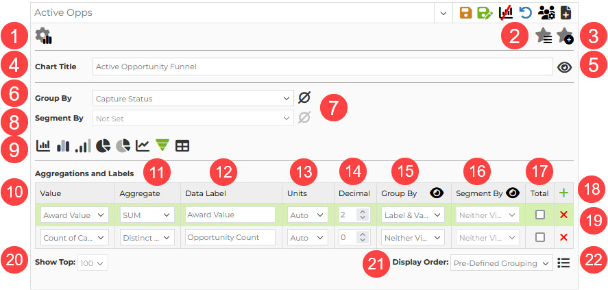
- Show/Hide Chart Settings: This icon will toggle between the view with the settings open or closed. Your most recent toggle setting will be applied when you return to the page after leaving.
- Favorite Charts: Click here to see a drop down list of your favorite charts to apply one to the page.
- Add to Favorites: Click this icon to save the current chart to your favorites list. This saves the chart to the list only; it does not save any filters applied to the dataset. If you are looking to save everything, you must save at the report level.
- Chart Title: The default shart title will be the report title. If you want to set a different title, enter it here.
- Show/Hide Title: Choose whether or not to show the title above the graph by toggling this setting.
- Group By: This value is the "determining factor" for the chart, i.e., the x-axis on graphs, the pie pieces on a pie chart, etc. Your Group by options on the pipeline page are all Capture2Proposal and custom capture date and drop down field types, plus a selection of other C2P fields that are well-designed for this type of analysis. In funded analytics, the options are all based on the award data fields available.
- Include/Exclude Nulls: Select this field to choose whether or not null values should be included in the results set. When the icon is green, null results will show in the chart.
- Segment By: This field can only be used in graph types that allow multiple groupings, such as bar graphs and line charts. The segment will be represented by the colorful segments in the graph, and will be identified by the legend.
- Chart Types: Toggle between the icons to change the chart type. To learn more about each type, click here.
- Value: While the Grouping determines what is important to measure, the value is the measure. The default value is a count of the group by category selected, but this can be changed to any numeric, currency, or percentage field offered by Capture2Proposal or available in your Custom Capture options. When more than one value exists, the top value is always the one used for measurement in all chart or graph types other than table, which shows each value as a separate column. Hovering over a graph segment will show all of the values included in this section; showing and hiding the values and labels without hovering will be set using fields 12-15. You can drag and drop rows to change the order of the values in the chart.
- Aggregate: Select what aggregate you want to use for the value. Some value types have limited options, but the full set of allowed calculations is: sum, average, min, max, count, distinct count, percent of total, and percent of displayed.
- Data Label: The data label field is hidden by default, and is set to Value - Aggregate by default. Click on the field and change the value to have a label that fits the style and data you want to convey with your chart. The data labels serve as the column headers in tables as well.
- Units: The default here is auto, which sets the units based on the average value of the displayed data. You can choose to set to none (ones), Thousands, Millions, Billions, or Trillions.
- Decimal: How many decimal places should be shown for the value. The default for this field is two.
Fields 15-17 all relate to data visibility at various levels of the chart, and options may be disabled when an option is not available with the current options selected for the chart. - Group By: The data visibility options for the group level of the chart. Selections here are column values in bar charts and stacked bar charts, or pie segments in pie charts, etc. For tables, each value is a column and setting the visibility here is not required.
- Segment By: The data visibility options for the segments. In a stacked bar chart, these will show in each colored segment, for example. In a clustered bar chart they will show for each bar.
- Total: This field allows you to display aggregates for the value across the displayed chart, and across the whole dataset. So if your chart shows the top 10 elements in the group, at the bottom of the chart you would see the aggregates for both the top 10 and for the entire dataset for comparison. These will show with the same aggregate type as selected in 11.
- Add Value: The green plus is used to add another value to the list of values calculated when building the chart.
- Delete Value: Use the x to remove a value from the chart calculations.
- Show Top X: Select how many groups to show in the results. Options range from 5-100. The default is 100.
- Display Order: The available options and the default display order will both vary based on the selected group by field. Value - High to Low is the most common setting for fields other than date fields. Pre-Defined Grouping refers to the order in which the fields appear in the drop-down list of options for that field within an opportunity.
- Show/Hide Legend: Toggle to show or hide the legend for the chart.